Everlytic-Next — SaaS Product Redesign
A modernised platform built for clarity, performance, and a simpler communication experience.
The Solution
A fully refreshed UI built on principles of clarity, focus, and hierarchy:
1. A cleaner, more intuitive navigation system
A fully redesigned sidebar with simplified categories, predictable grouping, and clear state management.
This dramatically improves discoverability and reduces cognitive load.
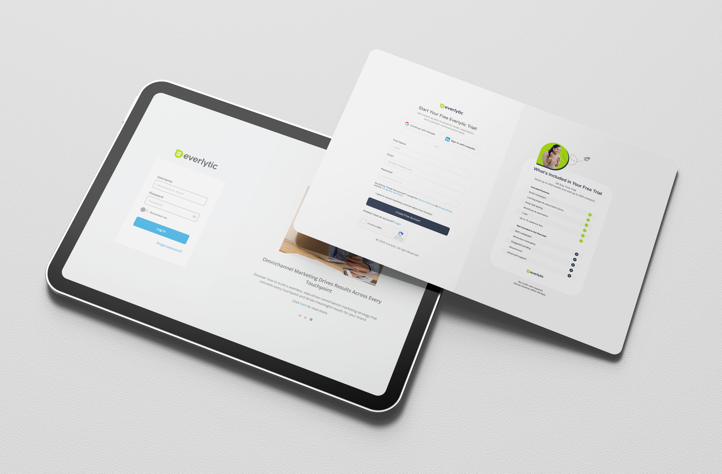
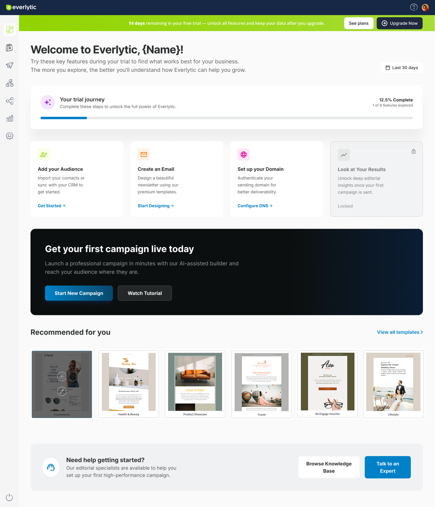
2. A beginner-friendly onboarding dashboard
A welcoming experience tailored to new users, showing:
✔ First-step actions
✔ Template previews
✔ Progress tracking
✔ Quick setup tasks
This reduces friction and improves trial conversion.
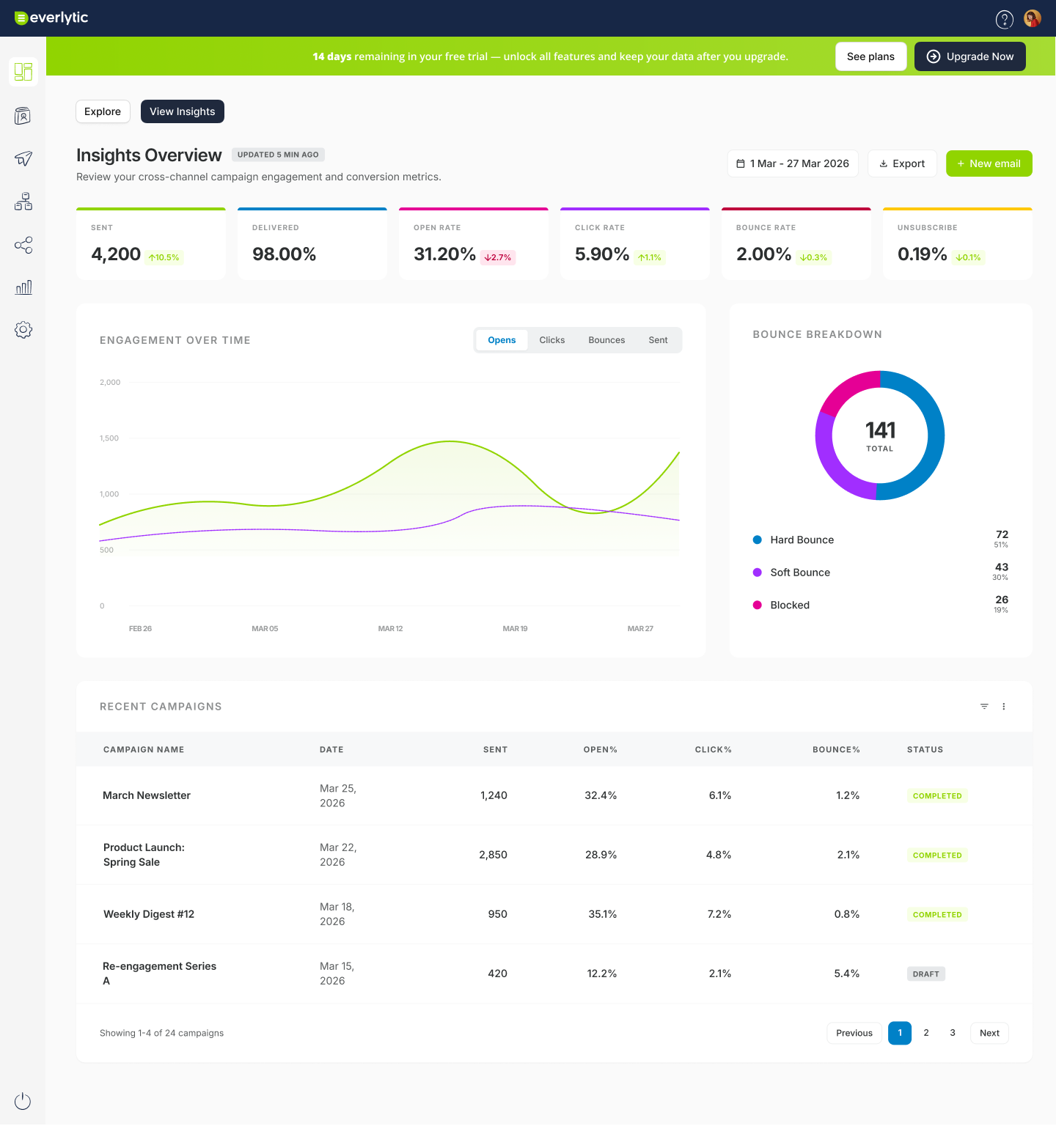
3. Modular dashboards & widgets
Flexible, tile-based dashboards that surface the most important insights:
Campaign performance
List activity
Domain health
Account statistics
Users can customise the view around what matters most.
4. Unifying the legacy and new UI into one design system
A cohesive visual language built around:
Clean layouts
Softer icons
Consistent spacing
A more modern colour palette
Flexible components for rapid future development
Project Highlights
✔ Complete UI overhaul across multiple modules
✔ Simplified workflows for campaigns, lists, settings, and automation
✔ Modern, scalable component system
✔ Improved readability, hierarchy, and user flow clarity
✔ Cleaner navigation that reduces friction and improves discoverability
✔ Elevated trial and onboarding experience
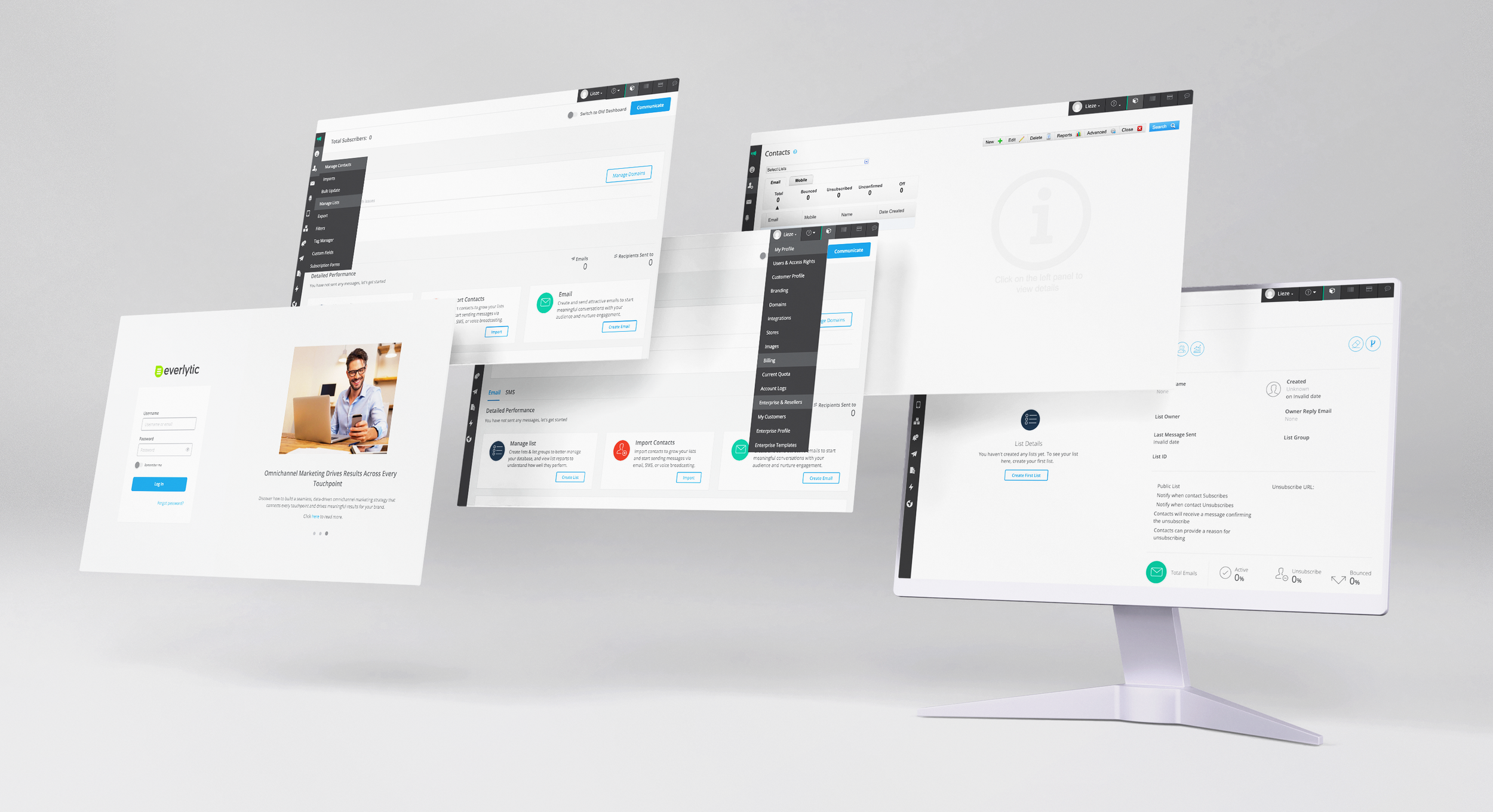
Everlytic outdated screens

New Onboarding & Reporting Dashboards
Project Overview
Client: Everlytic — Email, SMS & Automation Software
Role: Senior UX/UI Designer
Scope: Lead product design, UX flows, UI system, component library, and visual redesign
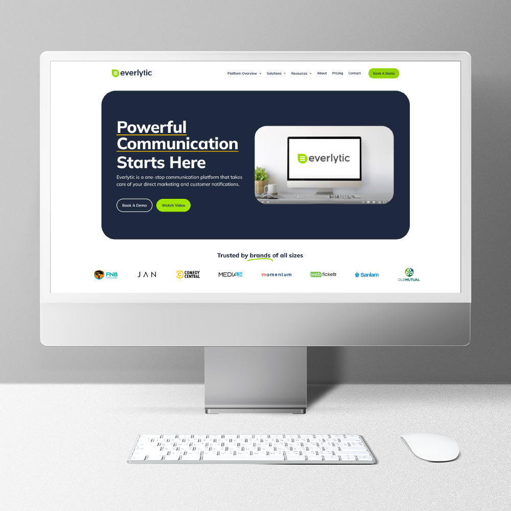
Everlytic-Next is the transformation of Everlytic’s legacy communication platform into a cleaner, faster, and more intuitive SaaS experience.
The goal:
Simplify complex workflows
Improve findability and navigation
Modernise the UI for scalability
Build a flexible design system that supports future features
I redesigned core areas of the platform — onboarding, dashboards, navigation, settings, lists, email building flows, and trial journeys — ensuring consistency across both new and old systems during the transition period.
The Challenge
Everlytic’s legacy product had grown over many years, resulting in:
Fragmented UX patterns
Outdated UI elements
Deep navigation layers
Inconsistent behaviours across modules
The challenge was to create a unified system that feels modern, intuitive, and scalable — without disrupting existing users.
Outcome
The new Everlytic-Next interface introduces a modern, unified, and user-friendly SaaS experience that sets the foundation for future features and growth.
It improves:
Speed of use
Clarity of navigation
Accessibility
Overall visual polish
…and guides the platform into its next product evolution.

New Sign Up Screen
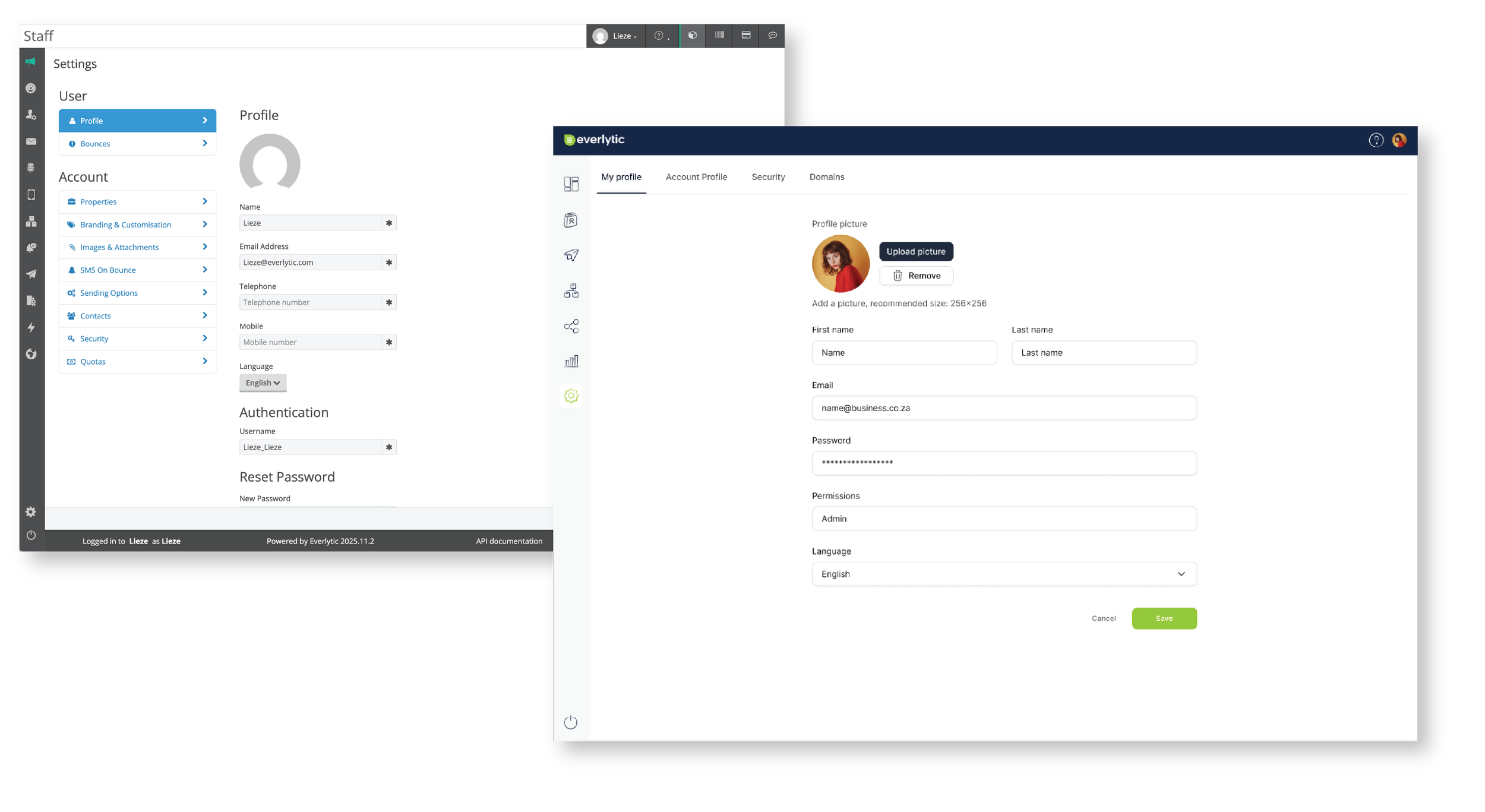
New Profile Settings Screen
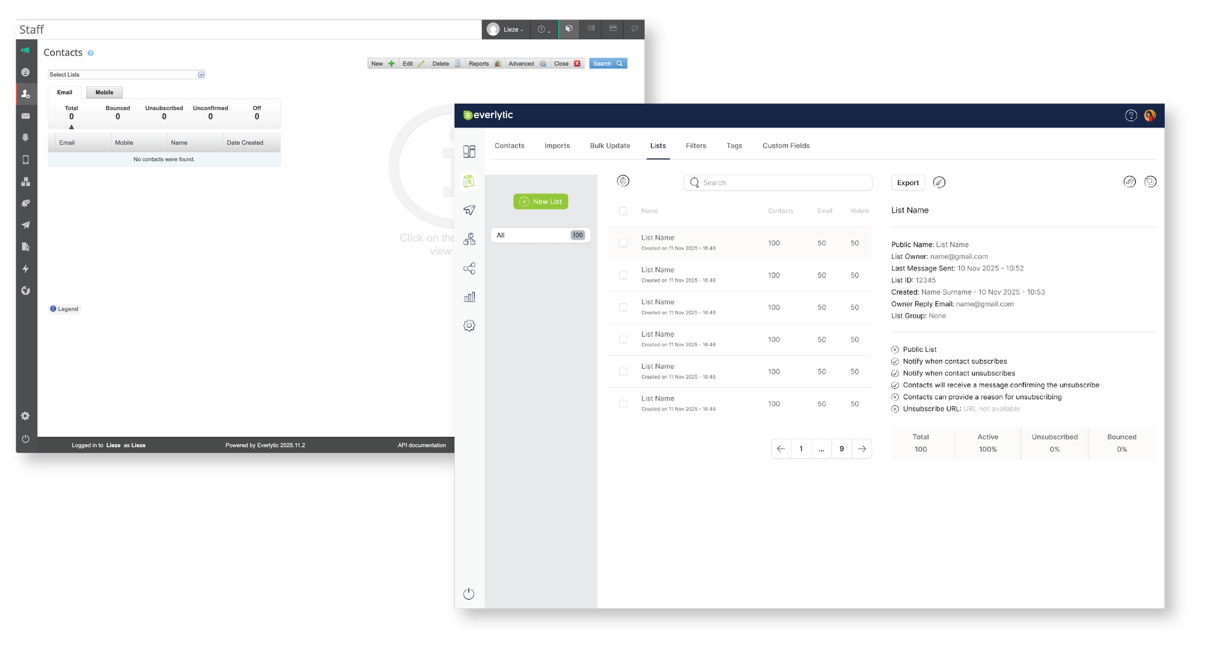
New List Management Screen