LUNAR GRACE — Brand Identity & Packaging Design
A soft, feminine brand identity crafted for a boutique skincare line.
Project Highlights
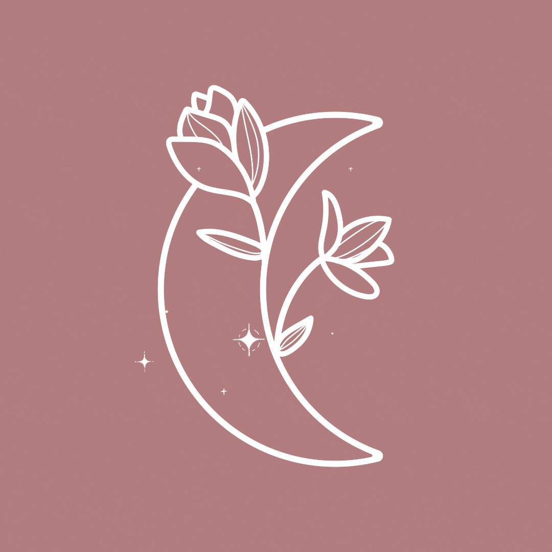
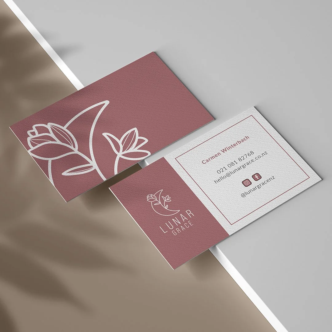
✔ Signature moon-and-floral brand mark
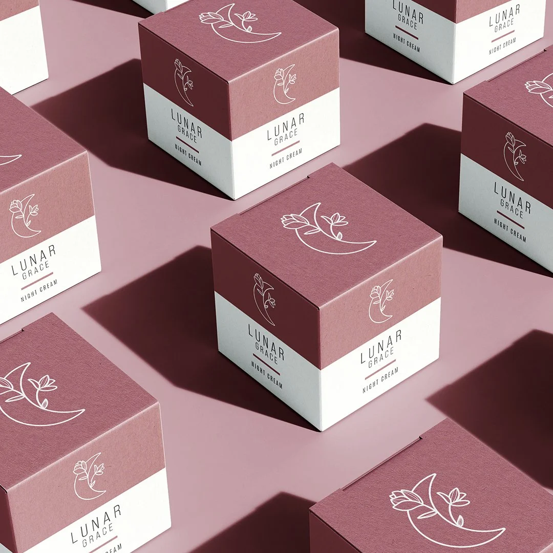
✔ Cohesive packaging system for multiple product types
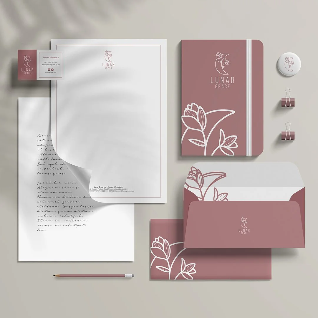
✔ Elegant stationery + lifestyle brand assets
✔ Soft, feminine palette supporting a luxury positioning
✔ Minimalist design language used across print + merchandise
Outcome
The Lunar Grace identity successfully captures the brand’s personality — delicate, intentional, and elevated. The cohesive visual system strengthened the brand’s presence at launch, creating a memorable, boutique-level experience across packaging and customer touchpoints.
Project Overview
Client: Lunar Grace
Role: Lead Designer (Brand + Packaging)
Scope: Visual identity · Logo design · Packaging system · Print collateral · Merchandising assets
Lunar Grace is a beauty brand built around gentle rituals and intentional self-care. The client needed a visual identity that felt serene, elegant, and rooted in natural femininity — something delicate, but still modern and memorable.
The Challenge
Create a refined identity that balances softness and sophistication, while building a cohesive design system that could expand across packaging, stationery, and lifestyle merchandise.
The Solution
The final identity centres around a hand-drawn moon and botanical illustration — a symbol of growth, cycles, and feminine energy. Paired with a muted rose palette, minimal typography, and subtle linework, the system brings calmness and clarity to every touchpoint.
A modular packaging grid allows for product expansion, while the brand iconography introduces a consistent visual story across boxes, labels, tags, and promotional materials.